


Heermance Newspaper
The Heermance Farm newspaper is a printed editorial piece designed to communicate the farm’s seasonal activity, partnerships, and cultural programming. Distributed to chefs, collaborators, and the broader community, the newspaper functions as both storytelling platform and brand communication tool. My role focused on designing the newspaper’s layout and visual structure—balancing the aesthetic of a traditional broadsheet newspaper with a contemporary graphic sensibility that reflects the creative identity of the Heermance brand.
Client
Heermance Farm
DELIVERABLES
Newspaper layout design, typographic systems, editorial spreads, print-ready production files
Year
2024-Present
Role
Creative Direction, Editorial Design, Graphic Design, Layout Design, Print Design

Brief
The publication needed to communicate the identity of Heermance Farm in a way that felt creative, artistic, and culturally relevant. Traditional editorial layouts or text-heavy storytelling wouldn’t capture the energy of the farm’s collaborations or its connection to food and art. The challenge was to create a magazine format that felt more like an art object than a marketing piece—something visually striking enough to live on a coffee table while still highlighting the people, ingredients, and ideas behind the farm.
Process/Solution
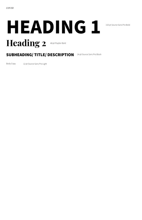
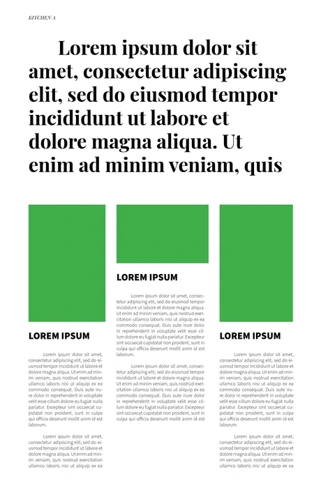
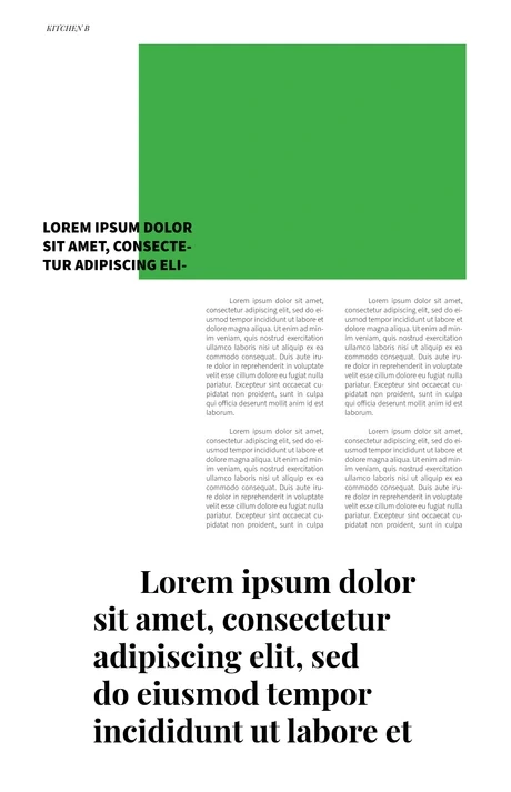
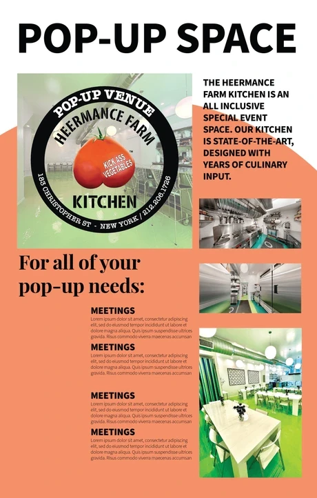
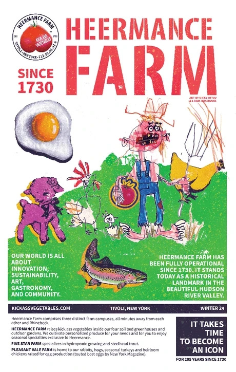
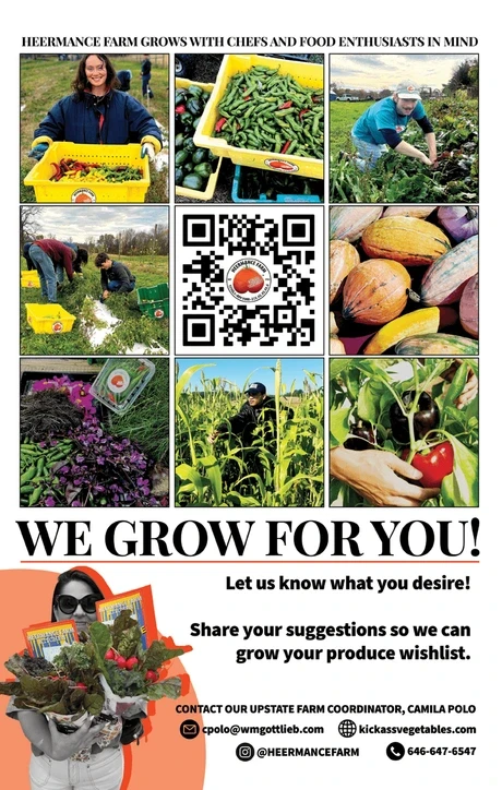
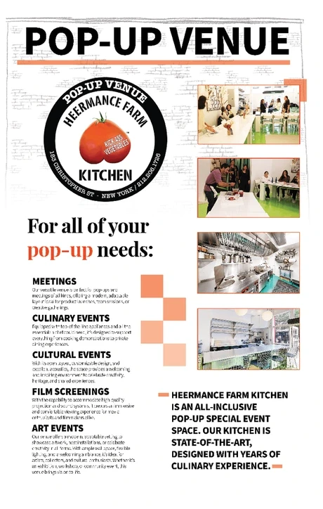
EDITORIAL STRUCTURE: I BEGAN BY ESTABLISHING A FLEXIBLE GRID SYSTEM THAT COULD SUPPORT A MIX OF ARTICLES, PHOTOGRAPHY, AND GRAPHIC ELEMENTS. THE GOAL WAS TO RETAIN THE READABILITY AND HIERARCHY ASSOCIATED WITH NEWSPAPER DESIGN WHILE INTRODUCING MORE EXPRESSIVE LAYOUT COMPOSITIONS. HEADLINES, CAPTIONS, AND BODY TEXT WERE ORGANIZED TO GUIDE THE READER THROUGH THE PUBLICATION WITHOUT OVERWHELMING THE PAGE.
BALANCING INFORMATION & VISUAL IDENTITY: UNLIKE THE ART-FOCUSED MAGAZINE, THE NEWSPAPER FORMAT REQUIRED CLEARER INFORMATION DELIVERY. I USED TYPOGRAPHIC HIERARCHY, COLUMN STRUCTURE, AND SPACING TO ORGANIZE CONTENT EFFICIENTLY WHILE STILL MAINTAINING VISUAL PERSONALITY. PHOTOGRAPHY FROM THE FARM, COLLABORATORS, AND EVENTS WAS INTEGRATED THROUGHOUT THE LAYOUT TO GROUND THE PUBLICATION IN REAL ENVIRONMENTS AND SEASONAL ACTIVITY.
MODERNIZING THE NEWSPAPER FORMAT: WHILE REFERENCING TRADITIONAL NEWSPAPER LAYOUTS, THE DESIGN INCORPORATES CONTEMPORARY GRAPHIC ELEMENTS TO BRING THE FORMAT INTO A MORE MODERN VISUAL LANGUAGE. SUBTLE COLOR, IMAGE PLACEMENTS, AND TYPOGRAPHIC CONTRASTS HELP CREATE VISUAL RHYTHM ACROSS SPREADS. THIS APPROACH ALLOWS THE NEWSPAPER TO REMAIN ACCESSIBLE AND INFORMATIVE WHILE STILL REFLECTING THE CREATIVITY AND ENERGY OF THE HEERMANCE BRAND.


Primary Planning Stages
solidifying options for type hierarchy, layout, and sizing
First rough draft
Experimenting with color, content & layout


Final deliverable
COLLABORATIVE PAGES SENT TO PRINT


Outcome
The newspaper serves as an accessible way to share the ongoing story of Heermance Farm with chefs, collaborators, and the surrounding community. By combining the familiarity of newspaper design with a more modern visual approach, the publication reinforces the farm’s identity while documenting the seasonal rhythm of the farm and its broader cultural network.