


Art & Gastronomy Magazine
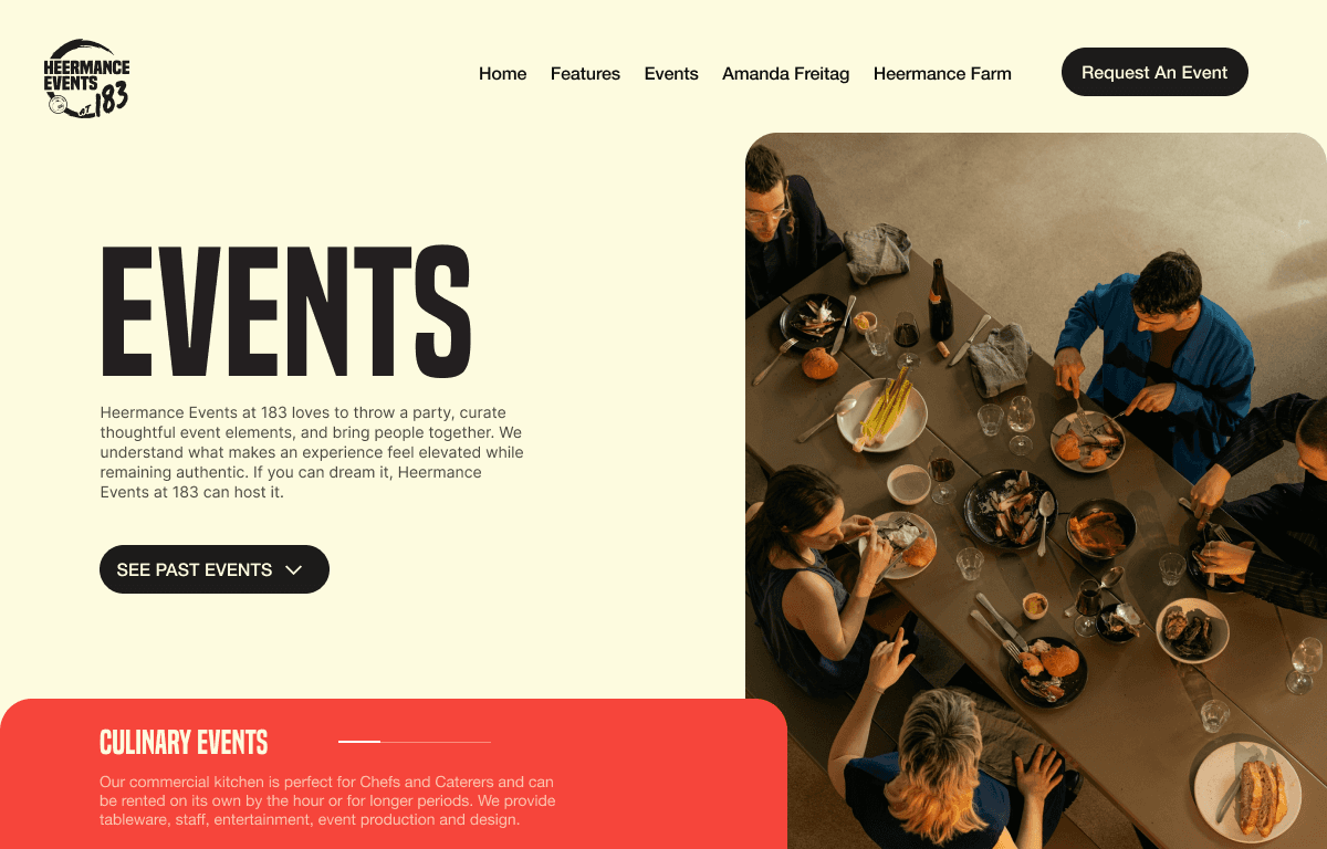
Heermance Art & Gastronomy is a biannual publication produced by Heermance Farm that explores food, agriculture, art, and culture through a highly visual editorial format. Rather than functioning as a traditional magazine, the publication is designed more like a collectible coffee table book—each section acting as a self-contained visual story. My role focused on designing the editorial layouts and visual compositions for the publication. Through collage, color, and expressive typography, the design emphasizes creativity and experimentation while showcasing the farm’s collaborations with chefs, artists, and cultural figures.
Client
Heermance
DELIVERABLES
Editorial layouts, magazine design, typographic systems, image direction, visual identity elements, print production files
Year
2024-Present
Role
Creative Direction, Editorial Design, Graphic Design, Layout Design


Brief
The publication needed to communicate the identity of Heermance Farm in a way that felt creative, artistic, and culturally relevant. Traditional editorial layouts or text-heavy storytelling wouldn’t capture the energy of the farm’s collaborations or its connection to food and art. The challenge was to create a magazine format that felt more like an art object than a marketing piece—something visually striking enough to live on a coffee table while still highlighting the people, ingredients, and ideas behind the farm.
Process/Solution
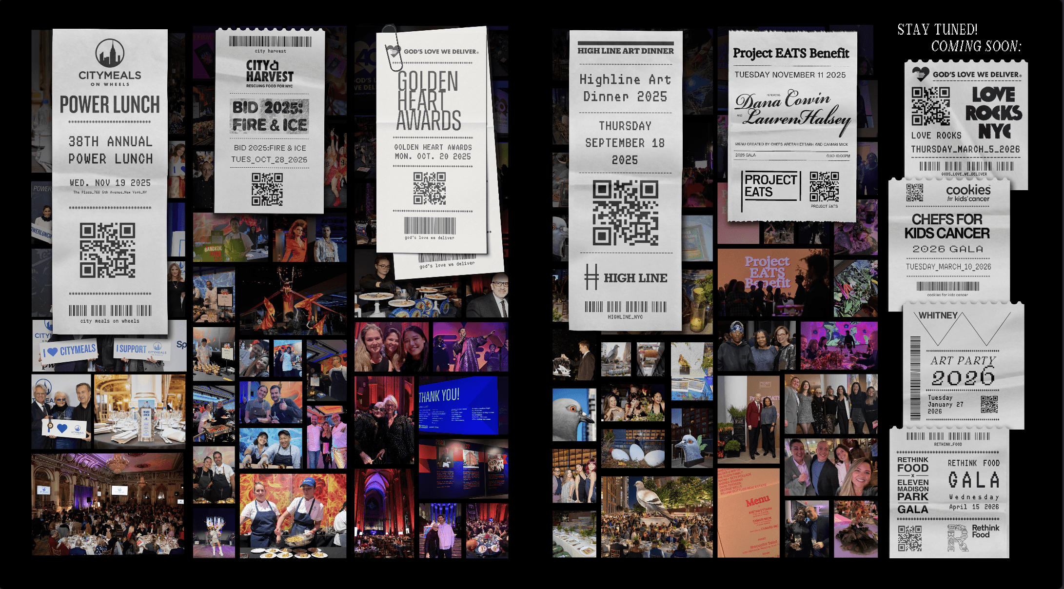
Visual Storytelling: Instead of relying heavily on text, the design approach centers on imagery, composition, and color. Each section of the magazine was treated as its own visual environment, allowing for shifts in mood, palette, and style across the publication. This structure gives the magazine a sense of discovery, where turning each page introduces a new visual language.
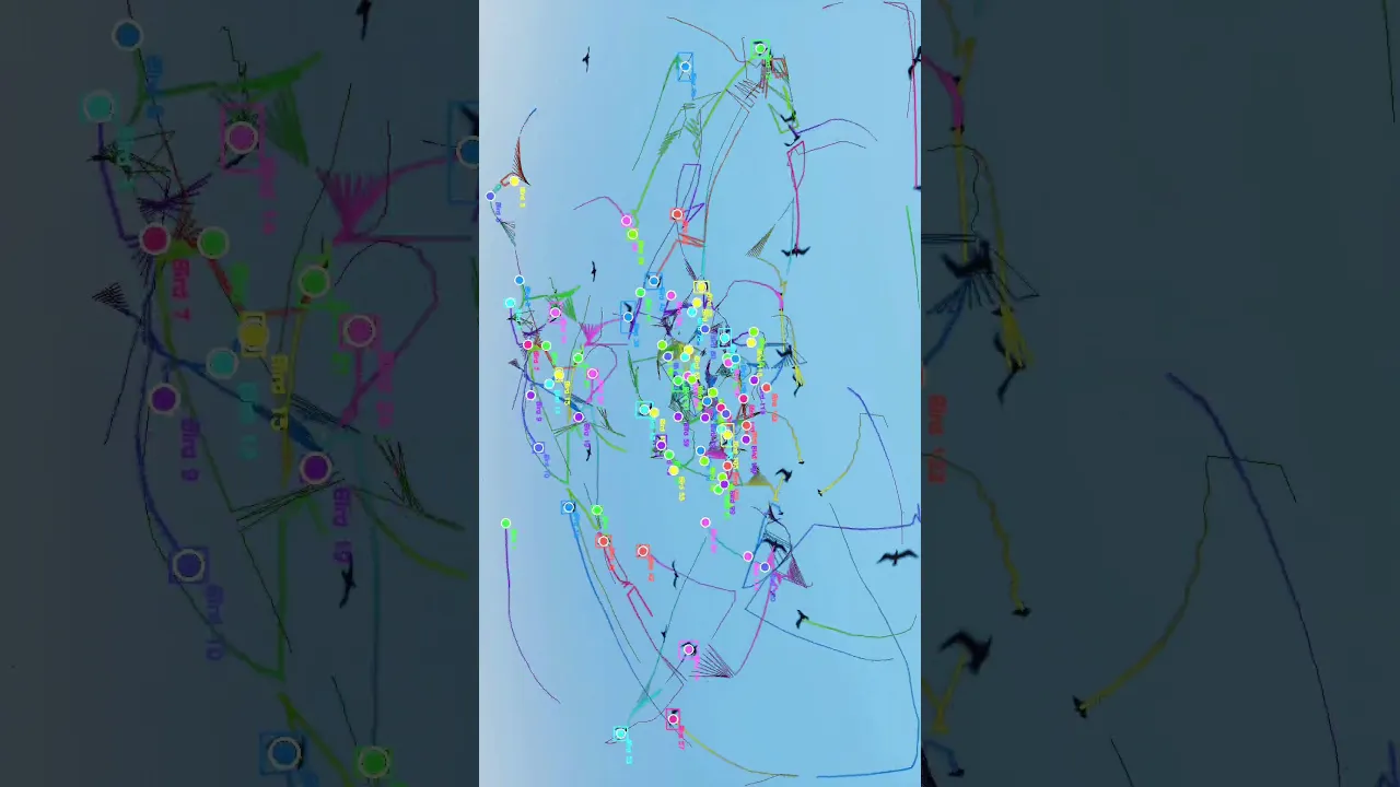
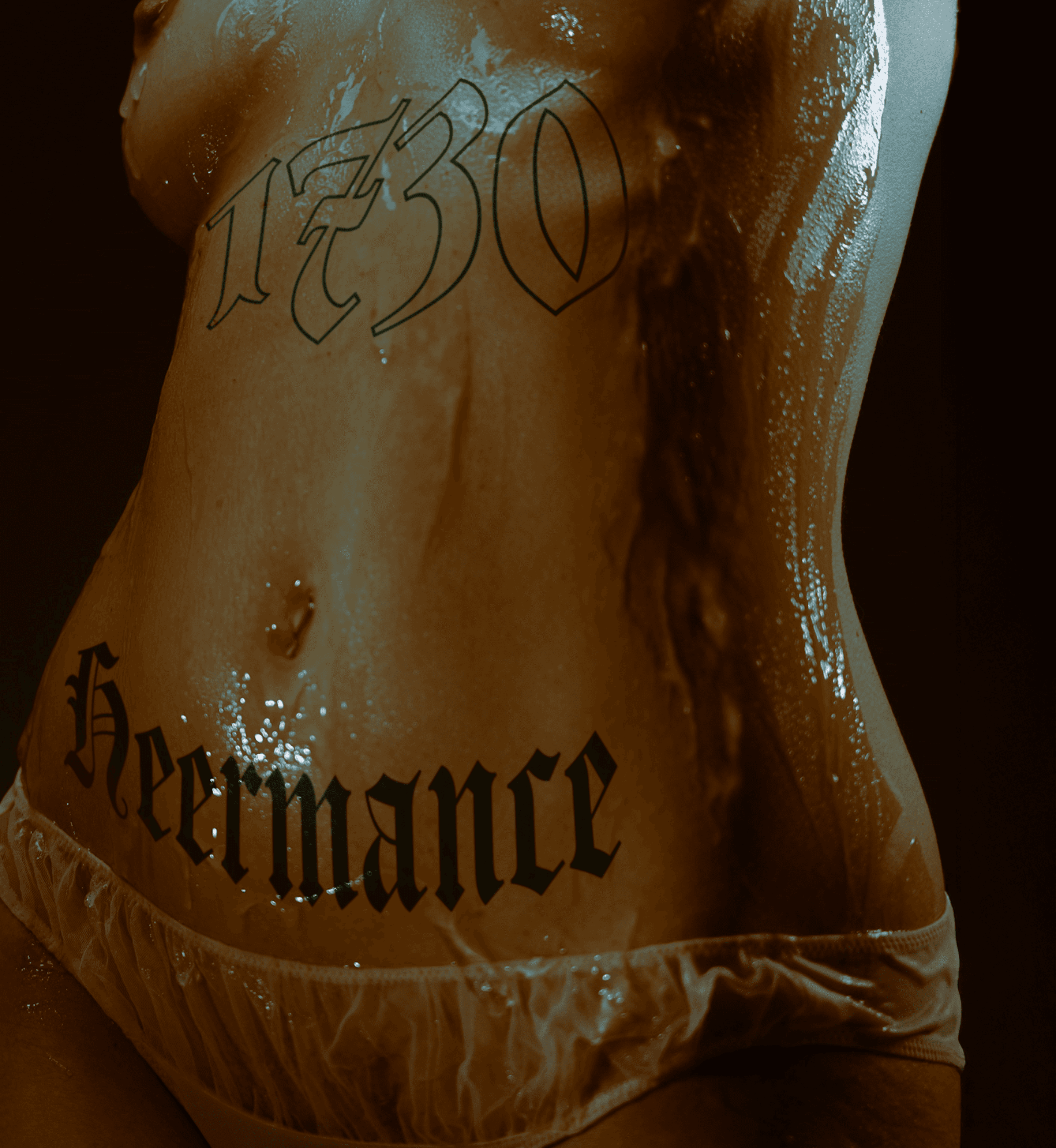
Collage & Image Manipulation: To reflect the creative spirit of the Heermance brand, I incorporated collage techniques, layered imagery, and graphic interventions into the layouts. Photography of food, farms, and collaborators was often edited, cut, layered, or juxtaposed with graphic elements to create compositions that feel more like artworks than standard editorial spreads. Bright colors, stylized imagery, and unexpected combinations of elements help reinforce the experimental tone of the publication.
Designing for the Object: Because the magazine is meant to function as a collectible piece, the design prioritizes visual impact and tactile presence. Large image spreads, bold compositions, and expressive typography encourage the reader to engage with the publication more like a visual book than a traditional article-driven magazine. The result is a publication that reflects the playful, creative spirit of Heermance Farm while positioning the brand within a broader conversation around food, art, and culture.

Outcome
The resulting publication presents Heermance Farm as more than an agricultural operation—it positions the brand within a larger cultural dialogue around food, art, and community. The magazine acts as a bridge between the farm, its collaborators, and the broader creative and culinary world, by informing readers of what we do within the community and our ethos. Through a cohesive editorial design system, the publication supports Heermance’s mission of connecting agriculture with culture while reinforcing the brand’s identity across print and digital channels.


